Dec 13, 2009

Project 5 - Final

Well after all the stress the project turned out really well! This is my completed template:
Crayola Package Template

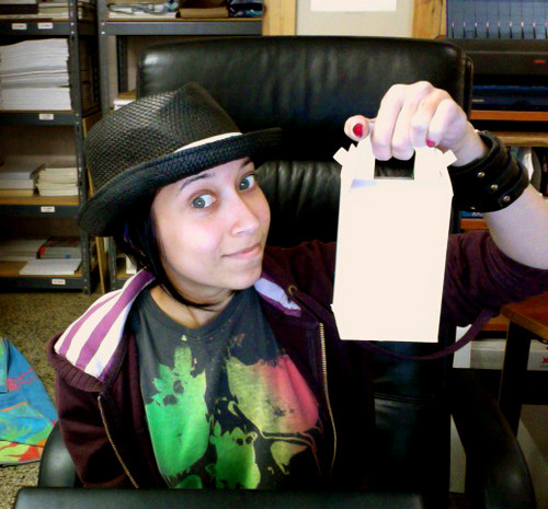
I decided to include a "surprise" inside the box, which I created in Illustrator:
Print

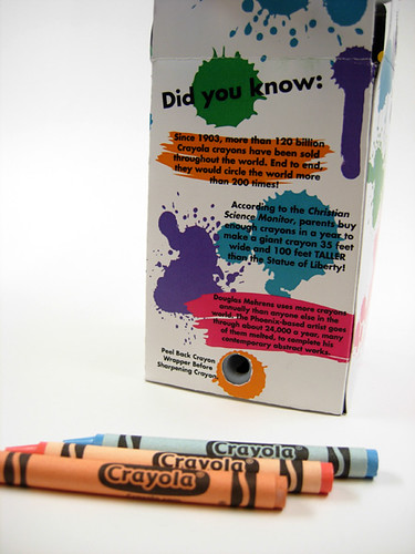
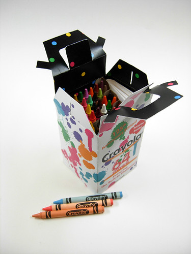
The box included the sharpener as well, of course, as you can see in these lovely photos that Paige generously took for us! :D

christine2

christine1

christine3

Dec 7, 2009

A Few Findings During This Project

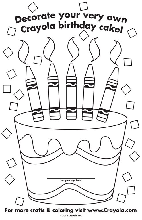
Apparently Crayola released an anniversary box on the 100th anniversary of the Crayola brand, in 2003. The box was the same shape as the regular ones, but this was a 100-count box with a metallic gold color replacing the regular yellow-gold, and a festive picture of a cake and confetti on the front:


My box is commemorating the 125th anniversary of the Binney & Smith company, while Crayola crayons weren't actually around until 1903. But, since next year is 2010 I wanted to make some sort of anniversary box, and luckily the company was founded in 1885 so it kind of worked out.

I also found this very old tin of Crayolas, though I am unsure of the actual date:


And here is a cool photo of Crayons in the factory XD

Dec 5, 2009

Whew!

So my first draft of the illustrator box template had to be altered. Quite a bit, actually. I am finally satisfied with the 3D version of the box. NOW I will finish up the outside layout. Oh, and I was so happy I took a pic!

Photo on 2009-12-05 at 19.42 #2

More later!

Dec 4, 2009

Packaging Template

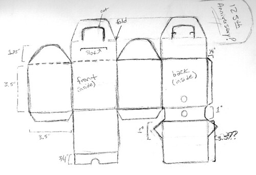
After a bit of deliberation, I decided to go with the "box with a handle." I was initially going to alter the template I posted earlier, which I found in Paige's packaging book, but a trip to Sam Flax a few nights ago proved to be very fortuitous, as I came across the perfect box to use as a template. It was already die-cut and ready for assembly. I flattened it out completely and made a composite sketch based on the box from Sam Flax as well as the Crayola 64 count box (in order to make the space for the sharpener). I then worked from the sketch I made and created a template in Illustrator. Luckily enough, the crayons in the larger boxes come in these "trays" that you can pull out of the box, so I think that I will be able to just use those trays and place them in the new box without much hassle of them moving around since the box is going to be pretty small, but just big enough to accommodate them.

Here is the initial sketch:
TemplateSketch


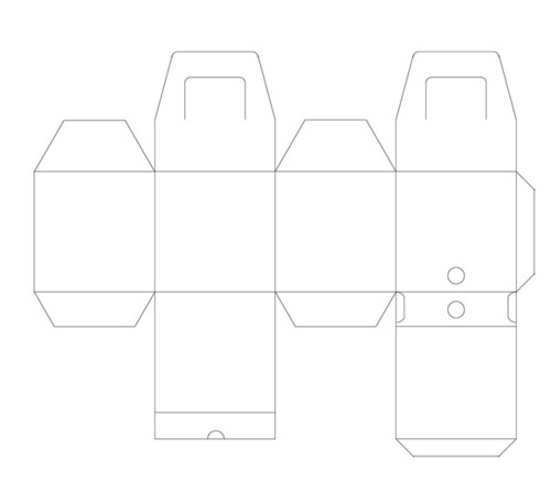
This is the Illustrator template. I'm sure I will have to tweak it once I actually print it out and attempt to assemble it, but this is basically finished:
MYTEMPLATE

Now I need to put the finishing touches on the outer design, which is the most important part! XD I want to do something special with it, as I'm thinking of packaging it as the "125th Anniversary Box." The Binney & Smith company (who founded the Crayola brand) was established in 1885. That's a long time! Maybe I could include a special "gift" or something inside, but I'm not sure what. I am also thinking of having a pattern of some sort on the inside of the box so that it's not just plain white. Maybe even re-design the crayon wrappers? That would take a long time though, which I'm running low on right now, so we'll see.

Some ideas for special "gift" inside:
Mini coloring book (include facts & history of Crayola)
Color-able sticker book
Coloring book of paper dolls
New color(s)
Fold-out coloring poster

Dec 1, 2009

Project 5 Progress

Anyone can recognize a Crayola package from a mile away. The signature colors, for as long as the Crayola brand has been around, are yellow (gold?) and green. That is the first thing I'm doing away with for my package re-designing. Here are some examples of Crayola through the years:


090904_fg10     
hij33
crayons


I came up with many different sketches as far as the visual design of the outer packaging. My favorite idea so far is to create a white package with literal splashes of color all over. I love the yellow "swoosh" beneath the logo, as it is reminiscent of a smile, which Crayola has previously alluded to in their crayon packaging. (You can see this in my previous blog post for this project.) Here is my concept:


packagesplatters


As far as the physical 3D design of the package, I am still somewhat undecided. My initial sketches were of a box in the shape of a sort of lunchbox with a handle. I'm still leaning towards the box-with-a-handle idea, as traditional Crayola crayon packages tend to stay along the lines of simple, rectangular boxes. Another idea I had was to create a cylindrical package with a string or handle on top. Whichever design I decide to use, I also want to incorporate the "built-in sharpener" that Crayola often includes in its crayon packaging. I found a template for a box with a handle that I could alter to fit my needs:

boxwithhandle

Here is an example of what I'm thinking of doing if I were to go with the cylinder box:
cylinderwstring

Nov 13, 2009

Project 5: Product Packaging

This is our last project. Exciting! I love creating 3-D mock-ups, even though they can be a huge headache. With this project we have a lot of free-reign, but that also makes the decision-making process a little harder. The basis of this project is to use image and type effectively to re-design an existing product package. Here are a few options I was looking at:


Crayola Crayons


Spangler Candy Canes


Betty Crocker Cake Mix


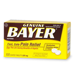
Bayer Aspirin


The possibilities are endless! Hopefully I'll decide on something soon...like this weekend!

Nov 10, 2009

Project 4: Event poster
So with only a week to work on this project and turn it in, I didn't have much time to post progress or inspiration, but this is the final version I came up with:

poster-2 smallRGB


Shonen Knife is a 3-piece Japanese girl pop-punk band. I wanted to do something fun and colorful that would reflect the spirit of the band, hence the candy-colored bubbles/marbles/sprinkles. The weird bird skeleton in the background is just something bizarre I decided to add. I intended to use something kind of "off," as that seems to be the current aesthetic for band posters, at least ones for local/smaller shows. I also added "Shonen Knife" in the background, written in katakana.


This is a previous version of this poster that I also came up with, but decided not to use:
poster-1 smallRGB


For this one, I wanted it to look like a bunch of post-it notes or bits of paper posted up on a board/wall. This is an actual photo I set up, and I decided to go with the photo on the right in homage to Shonen Knife, being comprised of 3 girls. :)

Oct 21, 2009

Project 3 Progress

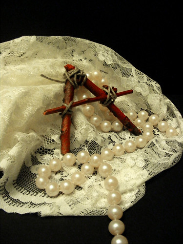
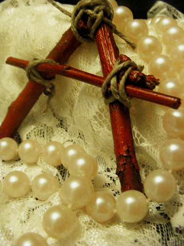
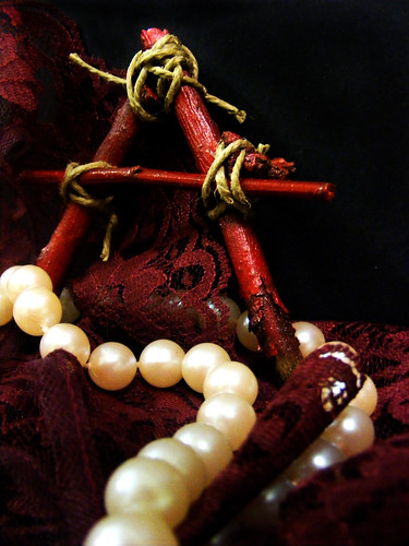
For the cover of my book design I definitely wanted to incorporate Pearls in some way, as Hester's daughter in the novel is named Pearl. So far I hadn't seen any other covers that used Pearls in their approach. I set about buying some supplies with which to compose a few photographs (a few turned into like 200!). Here are some sample results:

DSCF3546

DSCF3517

DSCF3425

DSCF3459


As for the back cover, I'm thinking of scanning in the lace texture and incorporating it in some way, just to add some interest rather than leaving it completely solid.

Oct 12, 2009

Example Book Covers for Project 3

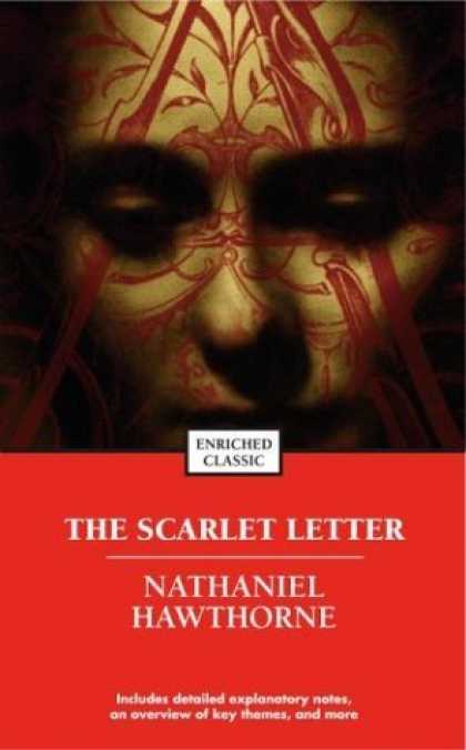
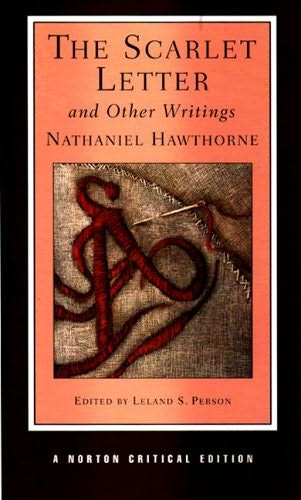
These are some books covers I found for The Scarlet Letter, which I have chosen to re-design for this next project. I found these to be the most interesting since they attempt to be a little more innovative in their approach


Oct 9, 2009

Project 2 Final Advertisements

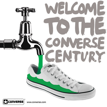
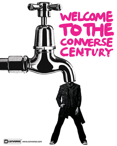
I decided to go with Converse Shoes for my company, as I thought it would lend itself well to a wide range of interpretation. Not quite knowing what I was planning yet, I scanned in a bunch of random images from magazines, one being a tap to a faucet that I became fond of. I decided to use the tap in my advertisements, and I also happened to scan in a photo of a hand which worked very nicely as well. The shoe images and the photo of the guy wearing Chucks were found online. The logo and tagline were downloaded from Brands of the World. As the ads started coming together, they became a reflection of the Converse brand: versatile, bold, simple.


3x10three copy     5x5three copy


converse2 copy

Sep 29, 2009

Old Photos

If you're looking for old b&w stock photos to use, this website has a decent collection: http://www.old-picture.com/

They're not the best resolution, but they are still kind of large, so they might be good for sizing down to use in smaller images.

Sep 21, 2009

Brands of the World (Lots of Vector Files!!)

A certain screenprinter I know turned me onto BrandsOfTheWorld.com, a website through which one can search for and upload vector files of many name-brand logos such as Pepsi, AT&T, Windows & many, many others. I thought this would be a great resource for everyone to use, especially during this next project. :)

Sample Advertisements for Project 2

I grabbed some magazines at the coffee shop I work at and leafed through them for some interesting ads and companies to use for this project. Here are some I found the most appealing:

Vitamin Water


Found in Details Magazine


Ray Ban Sunglasses

     
Found in Details Magazine


Found in Elle Magazine


Maybelline Cosmetics

Maybelline2     Maybelline1
Found in Elle Magazine


Converse

Converse
Found in Elle Magazine

Sep 17, 2009

Newest Obsession

I am a regular webcomic reader, and I recently happened upon this one which caused me much joy: Nedroid Picture Diary. It's so ridiculous, but hilarious at the same time. And nestled here and there among the entries you can find some useful Photoshop tutorials, if you explore a little bit. ;)

Personal Logo Project : Final Images

In the end, these were the two I decided to go with. I went with the "CMR" signature logo after all because it was the most personal to me. The second logo seemed to be a favorite, so I went with it because it was simple, clean, legible and kind of playful & dynamic at the same time.


Sep 8, 2009

Adding Color

So I took my favorite from the last set I posted and started adding color to it. I chose to use my two favorite colors, purple and green. I also played around a little with the placement of the letters, and also with a "drop shadow" effect using a darker color underneath.

Newer Logos in Illustrator

I re-created some of the new logo sketches in Illustrator. I haven't added color yet besides the one on the top right with the rainbow spilling out of it, but I would have to alter that one as we are only allowed to use 3 colors in total:


My favorite of these is the one at the bottom right. I think it lends itself well to possibly adding an illustrative element.

Sep 2, 2009

Blessing or Curse?

I forget how I came across this website, but I found it intriguing but also kind of distressing:

→Wix.com

So the premise of this site is: free fully-customizable flash websites! Totally awesome, but what does that mean for those of us wanting to concentrate our careers on web design? Flash is definitely the biggest, fastest-growing trend in web design that I've seen, so making it easily accessible to the masses is a logical step. However, it inevitably ends up "cutting out the middle man," so to speak. This is the first website like this that I have come across beside the myriad "myspace flash layout" sites, but those usually afford you less customization. I guess despite everything, there are still those clients and businesses who lack the technological/creative capabilities to do this sort of thing on their own and will still require the help of someone who has said skills.

I created an account and I may test it out if I find some free time to do so. ;)

Personal Logo Concepts Part Deux

As per instruction, I did a few more pages of sketching and picked these out as the best among them:


I tried to go in a less "scripty" direction. I used dafont.com as a source of inspiration, most notably the "techno" fonts. Of these, I favor 4, 8, 9 & 13. I would probably never use 11 for myself, but I threw it in there because I thought it was interesting nonetheless. To me, 9 looks like a container of some sort that has opened and ink/paint/etc. is spilling out. It could also be used without the bands of color and I think it would still be effective. I think 8 looks the most "techy" of these because of its streamlined, low-profile look.

I'll bring some of these into illustrator and see how they come out.