My first project in Paige's multimedia class was to create an animation based on one of the seven deadly sins: Greed. I finally got it uploaded, but I'm still having trouble getting the background song to play properly, or at all. Nevertheless, here is my animation.
Our next task is to make a flash e-greeting for a holiday/occasion of our choosing. I decided to make one for Dia de los Muertos (Day of the Dead). It's going to be a sugar-skull-maker where you can choose the shape of the skull and then all of the decorations that go on it. I'm really excited about this one, I've started doing the illustrations for it:
Sep 30, 2010
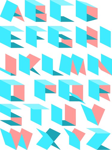
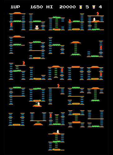
Type hybrids
Sep 28, 2010
Wine Bottle Re-design Choices
While perusing Kroger one night I found a couple somewhat interesting wines that needed re-designing. I wasn't too thrilled with what I found though, and the ones I actually had more interest in had already been done.
The first one I came across was The Smoking Loon by Don Sebastiani & Sons. The logo is kind of cool, but it could definitely be better:
Next was Bear Boat Wines, which has a vintage photo of two bears in a rowboat having a different witty conversation on each bottle.
Then, after exploring the Don Sebastiani & Sons website I discovered a wine called B Side and fell in love. The label is neat, but there is so much that could be done with the packaging.
Sep 25, 2010
Magazine Samples
While hunting down examples of magazine grid layouts at the SCAD library, I perused the current periodical shelves and snapped some shots of mastheads & covers that stood out to me.
Successful use of type:
The small line of type in the middle says "Do you like scratching?"
The name of the magazine (Hand Papermaking) is hard to read on top of the photo, but the magazine cover itself still stands out pretty well, despite:
It's clear to me now that I prefer covers with solid colors or patterns across the entire cover rather than photos. I plan on doing something in this vein for my own cover re-design.
It's clear to me now that I prefer covers with solid colors or patterns across the entire cover rather than photos. I plan on doing something in this vein for my own cover re-design.
Block of Type: N. Highland Ave.
I happened by Inman Perk earlier this afternoon and on my way to my car I looked around and realized that I was amidst a smorgasbord of typography specimens. Luckily I had my trusty little camera on me and decided to take a photo stroll around the area. This particular area has an abundance of chic restaurants and businesses with some well-designed and not-so-well-designed signage, and a touch of graffiti here and there. Here is what I found:
Click here to view the flickr set
Click here to view the flickr set
Sep 23, 2010
Flash E-Greeting Ideas
Fortune Teller E-Card
There's a fortune teller's "storefront" on my walk to school, which inspired me to want to use a fortune teller theme in one of my designs. I thought this was a cool e-card, but I don't think I will do a fortune teller for this project.
Valentine Card Creator
I really liked the art style for this one: Halloween Matching Game
Halloween Pumpkin Maker
I'm more drawn to e-cards that let you get creative and make something of your own. I think I want to make a Dia de los Muertos e-greeting where the recipient can decorate their own sugar skull. :) I couldn't find one like it on the web so far, but I did find a few Dia de los Muertos greetings on Blue Mountain. I especially liked this one & I thought this one was cute as well.
Inspirational Artists
I am a fan of webcomics, and one of my favorite things about following many different ones is to observe different art styles and watch the artists' styles change over time. Some of my very favorites are:
Octopus Pie is a quirky comic based in NYC.
Questionable Content
Wapsi Square
Jess Fink is a webcomic artist and illustrator. Her watercolor work is pretty great. Her comics tend to be more on the...risque side though. :P
Some oldschool artists that I forever admire are
As well I am very influenced by graffiti and cartoonish/graphic character design. I met this artist the other day at the East Atlanta Strut and fell in love with his characters:

Red Rocket Farm by Jason Thomas

Zipits Zipper Pulls - These are adorable and they are design that you can take with you anywhere!
Octopus Pie is a quirky comic based in NYC.
Questionable Content
Wapsi Square
Jess Fink is a webcomic artist and illustrator. Her watercolor work is pretty great. Her comics tend to be more on the...risque side though. :P
Some oldschool artists that I forever admire are
Roy Lichtenstein:
(Van Gogh a la Lichtenstein :P)
Mark Rothko's abstract & emotional works:
As well I am very influenced by graffiti and cartoonish/graphic character design. I met this artist the other day at the East Atlanta Strut and fell in love with his characters:

Red Rocket Farm by Jason Thomas

Zipits Zipper Pulls - These are adorable and they are design that you can take with you anywhere!
Sep 21, 2010
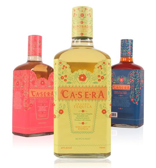
Wine Bottle Project Inspiration
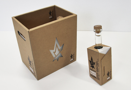
I like that they put the bottle in a box, but the neck of the bottle peeks out of the top:
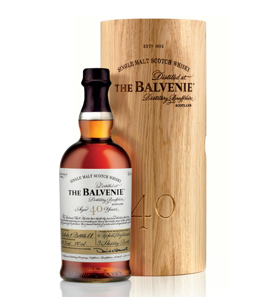
I simply enjoy the shape of this bottle:
It's almost like these bottles are wearing fancy dresses or something, what with the scalloped "neckline" of the label:
Sep 15, 2010
Sep 13, 2010
Sep 12, 2010
Current Design Trends
The most prominent trend I've noticed in design right now is the wide use of vintage-inspired imagery & type. Old patterns (wallpaper-esque), distressed textures, block or hand-rendered type, very graphic/stylized images & large solid blocks of colors. I think "70s" for the most part when I see things of this nature.


Poster from Methane Studios


Web ad

Scoutmob website


Poster from Methane Studios


Web ad

Scoutmob website

AlphabetPhotography.com
Someone's making hella money off this stuff! Check it out, I made my name:

Alphabetphotography.com

Alphabetphotography.com
Sep 11, 2010
Water Bobble

I found out about this through a book by TheDieLine.com. It's this really cool water bottle called Bobble that filters as you drink. They're decently priced & well designed (including their website), which is an added plus! I think I might pick one up soon! :)
Sep 9, 2010
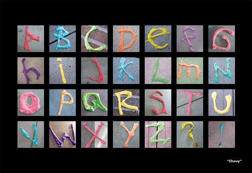
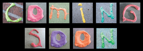
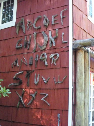
Illustrative Type Teaser
I was going to spell "Make Art" but I haven't completed all the letters yet. :P


Good & Bad design
The Bad
If you're going to use a shadow, at least try to make it look real...

Hansen's Cane Soda, a la my previous post.
Thank goodness they changed it!

• While actually searching for "bad graphic design" on Google, I saw a link to this Graphic Design group in New Hope, PA called BadCat Design. I wanted to check it out as I'm considering moving to or near Philly when I'm done here at GSU. Anyway, immediately upon opening their website I was turned off completely. Their logo in itself is horrible, and the site layout says "SNOOZE."
The Good
IZZE sparkling fruit juices. Delicious and eye-catching!

• The Coathangers' website is pretty fun, and easy to navigate. I love the colorful, DIY look.
Sep 7, 2010
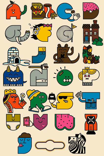
Illustrative Alphabet
Sep 3, 2010
Gmail Priority Inbox Animation
I love the simple artwork in this animation. It has a sketchy/hand-drawn look to it, but I'm sure it was probably created on a computer.
Sep 1, 2010
EatingWell Magazine Re-design : Creative Brief
From their website:
EatingWell Magazine is a tool designed to guide people passionate about eating more healthfully and joyfully in times when nutrition guidelines are ever-changing and when food is at the center of society-wide controversy and health concerns.
EatingWell has a 20-year reputation for delivering cutting-edge, authoritative, science-based nutrition articles and delicious recipes that represent a fusion of good taste and good health.
Our Mission
The EatingWell mission is to provide the inspiration and information people need to make healthy eating a way of life. We accomplish this in four ways:
* We deliver delicious, easy recipes that meet stringent guidelines for taste, nutrition and dependability, recipes easily replicated by home cooks.
* We report on the latest news on nutrition and health, providing practical, science-based answers consumers are looking for.
* We examine the connections between food, its origins and its impact on communities.
* We encourage people to make informed, mindful decisions about how they eat and to celebrate the joys of food.
Research & Goals for Re-designing EatingWell Magazine
EatingWell seems predominantly geared toward an audience consisting of mature women and women with families. I want to reposition EatingWell to appeal to a wider range of consumers (younger people aged 20s-30s, men, single dads...) by re-vamping the layout design, masthead, and content, as well as making the connection between digital and print content more apparent and accessible.
EatingWell Magazine is 8.5x11" (letter) in size, about 90 pages, full color and saddle-stitched. The layout mostly consists of 2 standard grids: half-page vertical and 3-column. I aim to break up the static rigidity of this grid system and incorporate more fluidity by using more graphics within the layouts and innovative type treatments. Most all pages with main copy text view as black type on white backgrounds, which I intend to refresh by utilizing different color scheme(s). As a whole it is very type- and photo-heavy in its design and requires a more spacious layout to give the reader's eye a break every few pages. As well I propose to incorporate more illustrations and abstract graphics to balance the heavy use of photography.
Content-wise, EatingWell focuses on recipes pertaining to different lifestyles and how various foods can affect one's health. My goal is to add content that appeals to younger, more diverse readers. One article concept is "Eating Healthy on the Road" and would relate to touring bands and how to stay healthy while road-tripping. EatingWell has an abundant online resource and backlog of articles and recipes, which needs to be made more apparent to its readers. EatingWell.com has a user account area which allows users to bookmark recipes & also has a menu planner feature which calculates your daily calories, fat, carbs & sodium, creates shopping lists, and has a BMI calculator, calorie & weight tracker, and journal. This information should be more readily-available to readers in the age of iPhones where most consumers get their information on-the-go.
EatingWell.com
Hansen's got a facelift
Every time I saw them, I always thought that the Hansen's cans looked terrible as far as their design went. Well it looks like they updated their look a little bit, finally!
Old

New

I haven't seen the updated "diet" cans yet. Hopefully they made a more noticeable distinction between the regular and diet. I remember purchasing a pack one time and not realizing that I picked up diet because the packaging looked so similar. Blech!

New

I haven't seen the updated "diet" cans yet. Hopefully they made a more noticeable distinction between the regular and diet. I remember purchasing a pack one time and not realizing that I picked up diet because the packaging looked so similar. Blech!
Subscribe to:
Posts (Atom)


