Dec 11, 2010
Noodle Noise Website Design!
Our final project in Paige's Multimedia Design class was to create a 6-page (minimum) educational web site geared towards middle school-aged kids. We were each assigned an over-arching subject (arts, science, math) and within that subject we each had topics to cover. For mine I chose photography. There was a lot of information to try to organize for this site, but I think I did well in making in approachable for this age range. Check it out!
Dec 6, 2010
Album Art
With the advent of digital music, I find myself more often than not downloading albums rather than going out and purchasing them. With a select few bands though (Muse, Jamiroquai, Green Day...) I still remain a dedicated fan and [usually] purchase the physical CDs when I get the chance. Anyway, here is some album art that I enjoy. :)
I like this cover of Radiohead's In Rainbows for the bold colors and large headlining type.

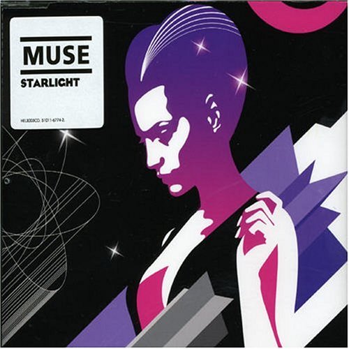
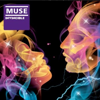
When Muse's (<3) Black Holes and Revelations came out I was overjoyed. The album artwork itself leaves some to be desired, but the subsequent artwork that was released for the various singles is exquisite!
Original Album:

Later artwork:

I was so in love with the above portrait of the band that I bought the poster, frame and all. It's absolutely lovely. :)



Beastie Boys' To the Five Boroughs has a cool package in that the digi pack folds out to reveal a super long, double-sided drawing of the East and West sides of NYC (one on either side) with the lyrics from the songs running throughout. Click the album cover below for more info:


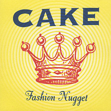
Cake's album art has a very strong, distinct look to it. The band name is bold at the top with a vintage-looking illustration below.


Beck's The Information had a very clever twist to its package. The cover looks very simplistic with "Beck" on the front and a light blue-on-white grid paper look for the background. When you open the package though, behind the seemingly plain insert is a fold-out sheet of stickers you can use to decorate the insert yourself! I used a few on sketchbooks and such, but sadly never actually used them on the CD insert. I should get a jump on that!
Click for more info:

I like this cover of Radiohead's In Rainbows for the bold colors and large headlining type.

When Muse's (<3) Black Holes and Revelations came out I was overjoyed. The album artwork itself leaves some to be desired, but the subsequent artwork that was released for the various singles is exquisite!
Original Album:

Later artwork:


I was so in love with the above portrait of the band that I bought the poster, frame and all. It's absolutely lovely. :)


Beastie Boys' To the Five Boroughs has a cool package in that the digi pack folds out to reveal a super long, double-sided drawing of the East and West sides of NYC (one on either side) with the lyrics from the songs running throughout. Click the album cover below for more info:


Cake's album art has a very strong, distinct look to it. The band name is bold at the top with a vintage-looking illustration below.


Beck's The Information had a very clever twist to its package. The cover looks very simplistic with "Beck" on the front and a light blue-on-white grid paper look for the background. When you open the package though, behind the seemingly plain insert is a fold-out sheet of stickers you can use to decorate the insert yourself! I used a few on sketchbooks and such, but sadly never actually used them on the CD insert. I should get a jump on that!
Click for more info:

On my search for images of album art, I found this awesome website that showcases different musicians' album artwork and gives in-depth info on the designs. Very cool!
Sleevage.com
Dec 5, 2010
Dreaming
I have a few recurring dream themes, one of which is the "teeth falling out" dream that it seems a lot of other people have too. Another one is that I accidentally eat meat. Mind you, I went vegetarian over a year ago, but I get these weird dreams where I "slip up." Anyway, I wanted to create an illustration that combined these two themes and this is what I came up with:
Collecting
I think it's in my genes to collect or hold onto things that I probably have no use for. For example, I collect matchbooks whenever I'm out somewhere, though I rarely use them for anything since I don't smoke & don't burn incense or candles very often. I just think they're neat since they're little pieces of design. :)
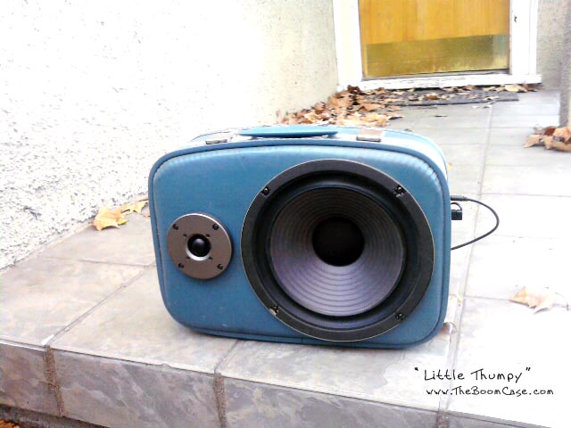
I've also been collecting vintage suitcases in hopes that one day I will find a use to make out of them. I've wanted to paint/decorate them and maybe resell them. I also found that really cool website where someone made amps/speaker boxes out of them.
I also collect cool/interesting event flyers. Working at a print shop, I print out a lot of flyers for different people. I usually make myself an extra copy if I especially like the design. I've collected so many and I've been meaning to put them up on my wall in some decorative fashion. I've only managed to hang up a couple though.
Another thing I collect is business cards. As with flyers and matchbooks, they are another form of design and I like to keep ones that I find attractive.
Dec 1, 2010
Calendar Tweaking
After talking with Stan I found a stronger direction with which to take my calendar. I came back to my earlier design of using the type in different arrangements for each month. It was more visually appealing to me, but still needed a little something extra. So, each month one of the items will be highlighted and it will include some info about that item; e.g. how to cook it, health benefits, facts, etc.
T-shirt designs
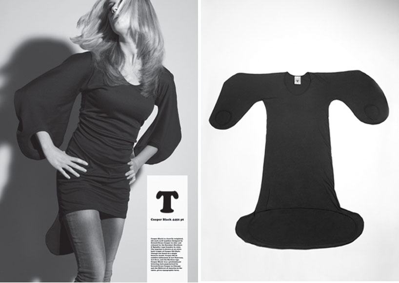
My favorite place to buy shirts is Threadless.com. I have SO many T-shirts from there, I have to refrain from going crazy every time they have a sale. Here are some of my favs that I've collected:
Flickrrrr
In case you didn't already know, I have a Flickr account that I've been keeping up with for a while now, check it: http://www.flickr.com/photos/christinerivera/
Nov 29, 2010
Infographic Progress
I was having a tough time deciding on what to do for my infographic. I quickly realized that my brain does not work well when trying to incorporate pictures with numbers. I finally came up with the idea to illustrate the map of the U.S. using the names of seasonal produce available in each region during the month of November (the month of my magazine issue). Not surprisingly, this idea came to me after deciding on the subject for my calendar. :P
Nov 28, 2010
Typography Calendar
So the idea I'm working with for the calendar is a 13-month seasonal produce calendar for the Southeast U.S. that informs the user of what produce is in season for each month. My first idea was to use the names of the fruits & veggies in different type arrangements with the dates for each month being on a separate page, so it would be a 2-page vertical spread suitable for a wall calendar:


After doing a few months' layouts, I was afraid that this would get too repetitive/boring. So then I tried a more illustrative approach, which would end up making each month a single-page layout:
I'm unsure of what might work better. Any suggestions?


After doing a few months' layouts, I was afraid that this would get too repetitive/boring. So then I tried a more illustrative approach, which would end up making each month a single-page layout:
I'm unsure of what might work better. Any suggestions?
Nov 19, 2010
Nov 13, 2010
Parish Restaurant Website Design
I got the Scoutmob coupon for Parish today and wanted to check out their menu on their website. I have to say, it's a very lovely design. It makes me think I'm reading some sort of publication.
Nov 12, 2010
Nov 11, 2010
Nov 10, 2010
New Table of Contents
While working on my main article for my Eat Well Magazine re-design, I played around with the table of contents again because I just wasn't satisfied with it, but I think I finally made a breakthrough that I'm pretty happy with. What do you think?
Nov 9, 2010
Creative Calendar Design
Click on each link/photo to read more.
Simple Numbers, Complicated Dates: 49 Innovative Calendars




Nov 8, 2010
Nov 7, 2010
Marc Tetro
I came across this guy's pop-outs while shopping at Sam Flax & I thought they were pretty awesome, and very simple. :) Check him out: Marc Tetro
Each week I feel as though I must check in at/with…
If you don't know by now that I'm a webcomic nerd, then let me reiterate: I am a webcomic nerd. Therefore, I have an ever-growing list of comics that I check in with multiple times a week. My favorites are:
Among others. :)
I also try to check in often with my classmates' blogs throughout the week. As lame as it sounds, I'm always on Facebook too, but besides e-stalking I sometimes come across interesting articles/websites/videos that my friends post on there, and I can share with them the things that I find interesting as well.
I didn't realize it until now, but another place I frequent often is the coffee shop across the street from my job, Joe's in East Atlanta Village. Whenever I go there I usually scan through their massive wall of flyer postings for shows and whatnot. Some of the posters are pretty well designed, others are more bizarre.
Reading Material
The following are some art/graphic design-related publications I've collected over the years. Ellen Lupton's works are obviously a favorite of mine. :)
One: Color by Paul Zelanski & Mary Pat Fisher - A great resource concerning color theory and more. It explains four color process printing, the psychology of color, the use of color in different artistic practices, etc.
Two: CMYK Magazine - I recently picked up an issue of CMYK Magazine (as it was one of the lesser-priced art magazines!) which showcases new creatives.
Three: How to be a Graphic Designer Without Losing Your Soul by Adrian Shaughnessy - I just purchased this a couple weeks ago. Haven't gotten a real chance to sit down and read through it, but I like what I've read so far. :)
Four: Graphic Design Theory, Editor Helen Armstrong - A lovely collection of writings from then and now concerning the theory of graphic design with a wide range of topics. In my art history classes I always found the theory behind artwork to be the most fascinating part.
Five: Graphic Design That Works (Rockport Publishers) - A collection of examples of successful design, ranging from logo design to magazine layouts to promotional and identity design. A good book to glean inspiration from.
Six: Design It Yourself (D.I.Y.) by Ellen Lupton - Nothing beats real, hand-made d.i.y. work. This books gives approachable tips on how to go about designing and physically creating various things from books, zines, notecards, coasters, t-shirts, CD packaging, and more.
Seven: Thinking With Type by Ellen Lupton - This was actually the required textbook for my Intro to Typography class. Gives you the history, technical terminology and practical usage of type, as well as showing examples of unique type treatments.
Subscribe to:
Posts (Atom)


