These are the 5 pieces that I believe were the strongest from my portfolio review.
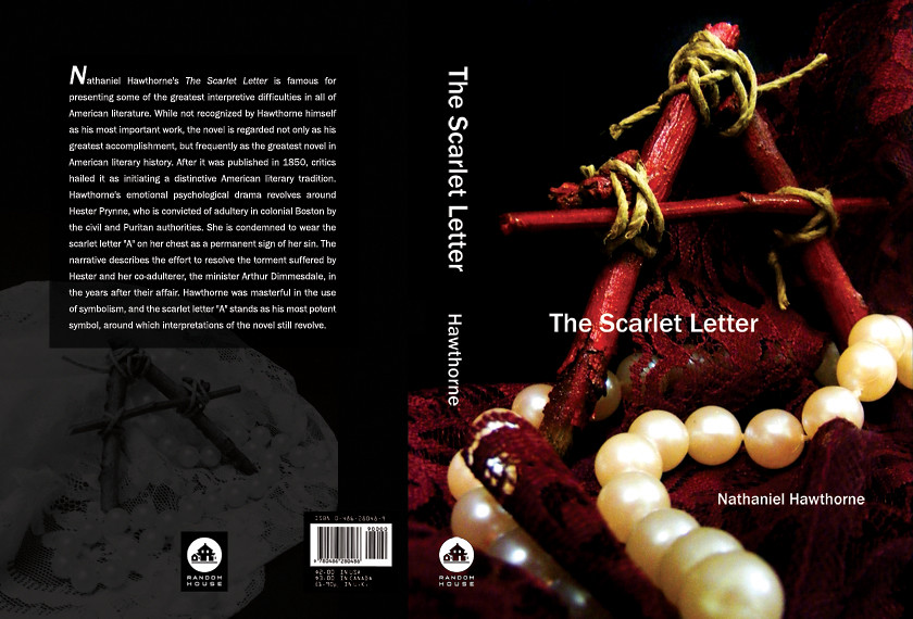
First up: my book cover redesign of The Scarlet Letter. This is my favorite piece of those that I submitted. Before the review, I re-worked the back cover, which originally only had a border of lace along the left-hand side. I thought it was too "blah" and needed something much more interesting, so I opted to take out the lace and use an alternate photo I had taken during the cover shoot and screen it in the background behind the text.
I'm pretty happy with my decision. :)

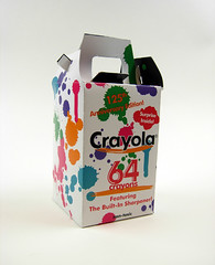
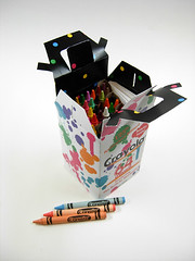
Next is my packaging project. I re-packaged a 64-count box of Crayola crayons for their "125th anniversary edition" with a special fold-out coloring poster inside. I worked the hardest on "engineering" the package itself & ultimately I think the handle could have been made stronger, which was my biggest challenge.
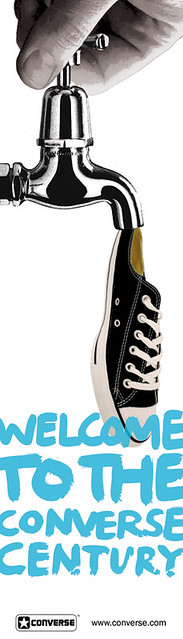
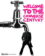
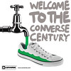
Up next is my Converse collage-ad campaign. We used found images from magazines and the internet to create 3 cohesive magazine ads. I used a mostly black-and-white scheme with a single splash of color in each. I also carried across the faucet image (scanned in from a magazine) and utilized it in different ways. I wanted to give it a surreal/absurd aesthetic, as Converse always seemed to have an "alternative" vibe.

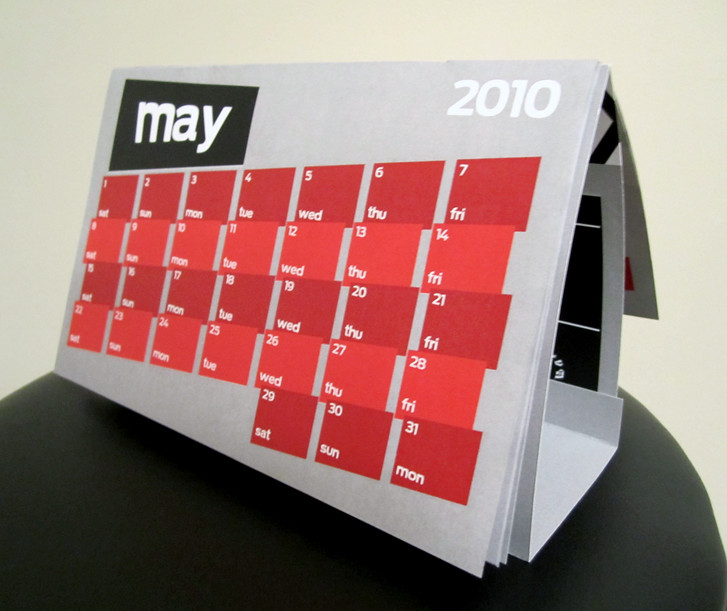
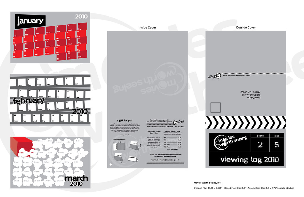
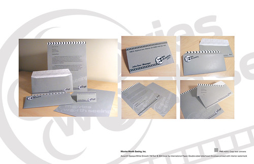
Next is my stationery suite for Movies Worth Seeing. It went through many transformations before becoming the final product, but I am satisfied with the outcome.
Lastly is my direct mailer from the same re-branding project as above. This was by far my favorite piece from the branding project, and it definitely took the most time.