Feb 28, 2010

Stationery Phase 2: Refining

Kim gave me some great advice/feedback on my stationery and helped me figure out which direction I wanted to take this. At first I had trouble making everything cohesive, but now I think I've better accomplished that. One concern I do have is that it's a LOT of gray, and I definitely don't want it to be overkill. What do you guys think?


Letterhead


Outside of envelope


Inside of envelope


Business card, tweaked

Feb 25, 2010

Stationery Progress

I'm still frantically working on everything, but I figured I really needed to post samples of what I had so far so I could get some feedback in the meantime. The first two images are letterhead examples. The last image is a business card. The background color I'm using is Pantone Warm Gray 9 U, although the colors look a little funky since I uploaded these images as a mixture of CMYK and RGB.


Letterhead screened pattern

Letterhead Strips Logo

Business Card


Like I said, still working on different options, and I hope to post more very soon, including the envelope.

Feb 23, 2010

Preliminary Sketches for Stationery Design

I have a lot of options with this assignment. These are a few preliminary sketches, a few of which I've already started creating:


Feb 16, 2010

Stationery Design: Initial Research

Now we're beginning to formulate ideas for our stationery pack (letterhead, envelope, business card) for our chosen companies. I have a few sketches, but still lots of work to do in the way of conceptualizing. Today in class I looked at some websites for inspiration and technical info regarding stationery design.

French Paper's website gives the different sizes for envelopes.

Inspiring stationery design examples

U.S. Postal requirements

Feb 10, 2010

Movies Worth Seeing: The Logo

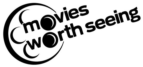
I believe I'm done! The logo lends itself to various colors, so I don't think this will be the end-all-be-all, but I decided to go with a bright shade of blue because, well, it seemed the only appropriate color to use since it's the most similar to black. Personally, I would prefer to stick with the all-black or black-and-grey logo, but like I said, it's variable. It depends on the application.

I also decided (after having it critiqued by an outside source) to move "seeing" from the bottom and place it next to "worth." It made the logo lighter, less cluttered. To furthermore help with uncluttering, I made the largest outer circle taper down to where it meets with the text, and left the space between the lines of text empty. This will help a bit when it scales down. I like the new placement of the text, as it is reminiscent of film coming out from the reel, or the light from a projector.

logo2v1

logo2v1

logo2v1

Feb 9, 2010

Finalizing the Logo

These first images came about from experiments in illustrator:
logo3

logo1

This is a more finalized version, derived from the image above. Not quite final, but then again nothing is ever complete, ha:
logo2

I'm currently in the process of refining this last logo. It's coming along nicely, so I'll be posting the final version soon!

Feb 4, 2010

Very Sketchy

So here I present a progression of sketches for my logo design for Movies Worth Seeing. I am keeping with a somewhat "retro" feel, that is, if physical film is now considered "retro." I was initially partial to using an image/shape of a film reel somewhere within the logo, and am still pretty strongly leaning in that direction. The 3 main ideas that stemmed from my sketches were film reels, spotlights/can lights, and movie screens. Movies Worth Seeing is a pretty modest, straightforward sort of place, so of course I want to convey that in the brand identity. The product speaks for itself. :)

scan001

scan003

scan004

scan005

scan006

scan002

scan007