Finally got around to scanning in my images from the initial sketches for project one. Here are what I think are the best from the first draft:
→ Click me to view!
So 5 & 6 are the way I usually sign my initials, but the only reason I am hesitant to use these in my final logo design is because I don't want to include my full name on everything. For my personal website and such I already only use my first and last name. Using my middle name would be unnecessary. So because of this, I am leaning more towards using something along the lines of 1, 2 or 8.
I want my logo to look organic and hand-rendered. I don't want it to be too geometric or illustrative. I'm all about expressive line and showing the hand of the artist in the work while simultaneously maintaining a sense of orderliness. Although I am also a fan of clean line, I think for a logo representing myself, something with more of a hand-drawn character would work best.
I broke out my tablet and started on some illustrator doodles based on the sketches I made. As you can see, I'm still playing around with using "CMR" as well as just "CR"
→ Click me to view!
I think the first one in the top left corner could be a winner. We'll see. :)
Aug 27, 2009
Aug 20, 2009
Stumbling
I found this site through Stumble Upon (actually, it was sent to me by a friend through Stumble). It's a combination of two of my favorite things: street art and graphic design. :)
→Cardon Copy
→Cardon Copy
Aug 19, 2009
Logo Examples
While searching for graphic design blogs to bookmark for future reference, I came across David Airey's list of top 50 graphic design blogs. Upon finding this site I also happened to find my first example logo, that being David Airey's personal logo, which is quite relevant to our first project:
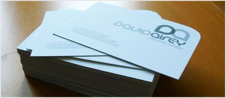

I very much love the simplicity of it and the fact that the font used for the logo itself is also used to spell out his full name, while all manages to remain legible.
The shapes of the letters in David's logo made me think of the Moen faucets logo:
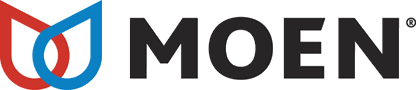
The Moen logo is effective because it is made up of two water droplets which represent hot and cold water, and together make up the shape of an "M." Outlining the water droplets rather than filling them in was a good decision because the area where the two overlap could be thought of as an "O," therefore making it "MO," and thus creating a stronger identity.
From David's website I followed a link to Graphic Design Blog.org which had a few lists of its own concerning logo design. Here are a few that stood out to me:


Forkwire:
Seeing as it is an online food delivery service, this logo serves its purpose well. Anyone familiar with email and/or webculture will identify the oh-so-familiar shape of the infamous "@" symbol, with the "a" in the center replaced by a fork. Simple at face value while containing a deeper meaning that is easily recognized/understood. The best formula for a logo, in my opinion.
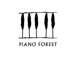
Piano Forest:
I'm not sure what kind of company or business this logo is representing, though it provides an apt literal representation of the company name. The line of trees becomes the keys on a piano with a slight shift of vision and the line added above.
Killed:
A playful use of type that illustrates the name of the company.
Schizophrenic:
Another logo that is most easily recognized by anyone familiar with chatspeak/webculture. It uses simplicity to represent something that is quite the opposite. Oxymoron?
Also on Graphic Design Blog.org were a few logos that I thought didn't quite get the job done as well as hoped:


The reason I chose these three is because they seem a bit illegible, which is an unfavorable trait to have when you're trying to relay something to an audience, that is unless vagueness is more your bag. . . . ?
From a book that I own called "Graphic Design That Works," I discovered some more examples of effective logo design:
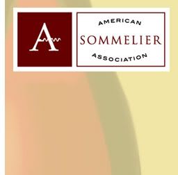
ASA:
The logo for the American Sommelier Association incorporates the shape of a corkscrew into the cross bar of the letter "A" and extends past the right leg as emphasis. The melding of image and text in this logo successfully portrays the identity of the organization.
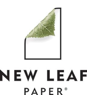
New Leaf:
This logo illustrates the saying "Turning over a new leaf," from which the company gets its name. Not only does it exemplify the company name, but it also shows a contrast between the harsh black-and-white outline of the sheet of paper and the soft organic image of the leaf, furthering their impression of being "environmentally responsible."
http://www.davidairey.com/
http://www.designer-daily.com/
http://www.adgoodness.com/
http://www.underconsideration.com/speakup/
http://www.underconsideration.com/quipsologies/
I very much love the simplicity of it and the fact that the font used for the logo itself is also used to spell out his full name, while all manages to remain legible.
The shapes of the letters in David's logo made me think of the Moen faucets logo:
The Moen logo is effective because it is made up of two water droplets which represent hot and cold water, and together make up the shape of an "M." Outlining the water droplets rather than filling them in was a good decision because the area where the two overlap could be thought of as an "O," therefore making it "MO," and thus creating a stronger identity.
From David's website I followed a link to Graphic Design Blog.org which had a few lists of its own concerning logo design. Here are a few that stood out to me:
Forkwire:
Seeing as it is an online food delivery service, this logo serves its purpose well. Anyone familiar with email and/or webculture will identify the oh-so-familiar shape of the infamous "@" symbol, with the "a" in the center replaced by a fork. Simple at face value while containing a deeper meaning that is easily recognized/understood. The best formula for a logo, in my opinion.
Piano Forest:
I'm not sure what kind of company or business this logo is representing, though it provides an apt literal representation of the company name. The line of trees becomes the keys on a piano with a slight shift of vision and the line added above.
Killed:
A playful use of type that illustrates the name of the company.
Schizophrenic:
Another logo that is most easily recognized by anyone familiar with chatspeak/webculture. It uses simplicity to represent something that is quite the opposite. Oxymoron?
Also on Graphic Design Blog.org were a few logos that I thought didn't quite get the job done as well as hoped:
The reason I chose these three is because they seem a bit illegible, which is an unfavorable trait to have when you're trying to relay something to an audience, that is unless vagueness is more your bag. . . . ?
From a book that I own called "Graphic Design That Works," I discovered some more examples of effective logo design:
ASA:
The logo for the American Sommelier Association incorporates the shape of a corkscrew into the cross bar of the letter "A" and extends past the right leg as emphasis. The melding of image and text in this logo successfully portrays the identity of the organization.
New Leaf:
This logo illustrates the saying "Turning over a new leaf," from which the company gets its name. Not only does it exemplify the company name, but it also shows a contrast between the harsh black-and-white outline of the sheet of paper and the soft organic image of the leaf, furthering their impression of being "environmentally responsible."
http://www.davidairey.com/
http://www.designer-daily.com/
http://www.adgoodness.com/
http://www.underconsideration.com/speakup/
http://www.underconsideration.com/quipsologies/
Subscribe to:
Posts (Atom)