I love the simple artwork in this animation. It has a sketchy/hand-drawn look to it, but I'm sure it was probably created on a computer.
Sep 3, 2010

Sep 1, 2010
EatingWell Magazine Re-design : Creative Brief
From their website:
EatingWell Magazine is a tool designed to guide people passionate about eating more healthfully and joyfully in times when nutrition guidelines are ever-changing and when food is at the center of society-wide controversy and health concerns.
EatingWell has a 20-year reputation for delivering cutting-edge, authoritative, science-based nutrition articles and delicious recipes that represent a fusion of good taste and good health.
Our Mission
The EatingWell mission is to provide the inspiration and information people need to make healthy eating a way of life. We accomplish this in four ways:
* We deliver delicious, easy recipes that meet stringent guidelines for taste, nutrition and dependability, recipes easily replicated by home cooks.
* We report on the latest news on nutrition and health, providing practical, science-based answers consumers are looking for.
* We examine the connections between food, its origins and its impact on communities.
* We encourage people to make informed, mindful decisions about how they eat and to celebrate the joys of food.
Research & Goals for Re-designing EatingWell Magazine
EatingWell seems predominantly geared toward an audience consisting of mature women and women with families. I want to reposition EatingWell to appeal to a wider range of consumers (younger people aged 20s-30s, men, single dads...) by re-vamping the layout design, masthead, and content, as well as making the connection between digital and print content more apparent and accessible.
EatingWell Magazine is 8.5x11" (letter) in size, about 90 pages, full color and saddle-stitched. The layout mostly consists of 2 standard grids: half-page vertical and 3-column. I aim to break up the static rigidity of this grid system and incorporate more fluidity by using more graphics within the layouts and innovative type treatments. Most all pages with main copy text view as black type on white backgrounds, which I intend to refresh by utilizing different color scheme(s). As a whole it is very type- and photo-heavy in its design and requires a more spacious layout to give the reader's eye a break every few pages. As well I propose to incorporate more illustrations and abstract graphics to balance the heavy use of photography.
Content-wise, EatingWell focuses on recipes pertaining to different lifestyles and how various foods can affect one's health. My goal is to add content that appeals to younger, more diverse readers. One article concept is "Eating Healthy on the Road" and would relate to touring bands and how to stay healthy while road-tripping. EatingWell has an abundant online resource and backlog of articles and recipes, which needs to be made more apparent to its readers. EatingWell.com has a user account area which allows users to bookmark recipes & also has a menu planner feature which calculates your daily calories, fat, carbs & sodium, creates shopping lists, and has a BMI calculator, calorie & weight tracker, and journal. This information should be more readily-available to readers in the age of iPhones where most consumers get their information on-the-go.
EatingWell Magazine is a tool designed to guide people passionate about eating more healthfully and joyfully in times when nutrition guidelines are ever-changing and when food is at the center of society-wide controversy and health concerns.
EatingWell has a 20-year reputation for delivering cutting-edge, authoritative, science-based nutrition articles and delicious recipes that represent a fusion of good taste and good health.
Our Mission
The EatingWell mission is to provide the inspiration and information people need to make healthy eating a way of life. We accomplish this in four ways:
* We deliver delicious, easy recipes that meet stringent guidelines for taste, nutrition and dependability, recipes easily replicated by home cooks.
* We report on the latest news on nutrition and health, providing practical, science-based answers consumers are looking for.
* We examine the connections between food, its origins and its impact on communities.
* We encourage people to make informed, mindful decisions about how they eat and to celebrate the joys of food.
Research & Goals for Re-designing EatingWell Magazine
EatingWell seems predominantly geared toward an audience consisting of mature women and women with families. I want to reposition EatingWell to appeal to a wider range of consumers (younger people aged 20s-30s, men, single dads...) by re-vamping the layout design, masthead, and content, as well as making the connection between digital and print content more apparent and accessible.
EatingWell Magazine is 8.5x11" (letter) in size, about 90 pages, full color and saddle-stitched. The layout mostly consists of 2 standard grids: half-page vertical and 3-column. I aim to break up the static rigidity of this grid system and incorporate more fluidity by using more graphics within the layouts and innovative type treatments. Most all pages with main copy text view as black type on white backgrounds, which I intend to refresh by utilizing different color scheme(s). As a whole it is very type- and photo-heavy in its design and requires a more spacious layout to give the reader's eye a break every few pages. As well I propose to incorporate more illustrations and abstract graphics to balance the heavy use of photography.
Content-wise, EatingWell focuses on recipes pertaining to different lifestyles and how various foods can affect one's health. My goal is to add content that appeals to younger, more diverse readers. One article concept is "Eating Healthy on the Road" and would relate to touring bands and how to stay healthy while road-tripping. EatingWell has an abundant online resource and backlog of articles and recipes, which needs to be made more apparent to its readers. EatingWell.com has a user account area which allows users to bookmark recipes & also has a menu planner feature which calculates your daily calories, fat, carbs & sodium, creates shopping lists, and has a BMI calculator, calorie & weight tracker, and journal. This information should be more readily-available to readers in the age of iPhones where most consumers get their information on-the-go.
EatingWell.com
Hansen's got a facelift
Every time I saw them, I always thought that the Hansen's cans looked terrible as far as their design went. Well it looks like they updated their look a little bit, finally!
Old

New

I haven't seen the updated "diet" cans yet. Hopefully they made a more noticeable distinction between the regular and diet. I remember purchasing a pack one time and not realizing that I picked up diet because the packaging looked so similar. Blech!
New
I haven't seen the updated "diet" cans yet. Hopefully they made a more noticeable distinction between the regular and diet. I remember purchasing a pack one time and not realizing that I picked up diet because the packaging looked so similar. Blech!
Aug 30, 2010
Timeline
At first I thought it was going to turn out really lame, but I actually kinda really like it now. :) I guess you could say it "grew" on me. Yuk yuk yuk.

I took a collection of photos of my own hair "tails" and 'shopped them together. I think the Baskerville tops it all off by making it look like something out of a history book.
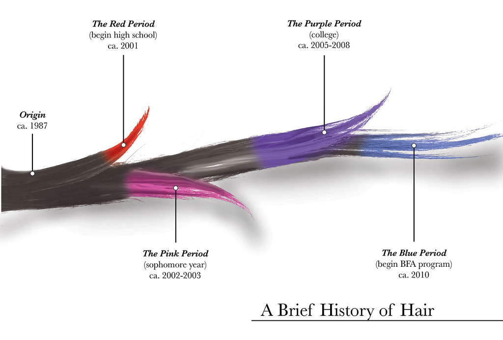
I took a collection of photos of my own hair "tails" and 'shopped them together. I think the Baskerville tops it all off by making it look like something out of a history book.
Aug 29, 2010
Self Portrait Board Progress
Making progress on the self-portrait board and *starting* on the timeline. Here is what I have so far:
Newest

Older

Comments?
Newest

Older

Comments?
Aug 27, 2010
The Big 5
These are the 5 pieces that I believe were the strongest from my portfolio review.
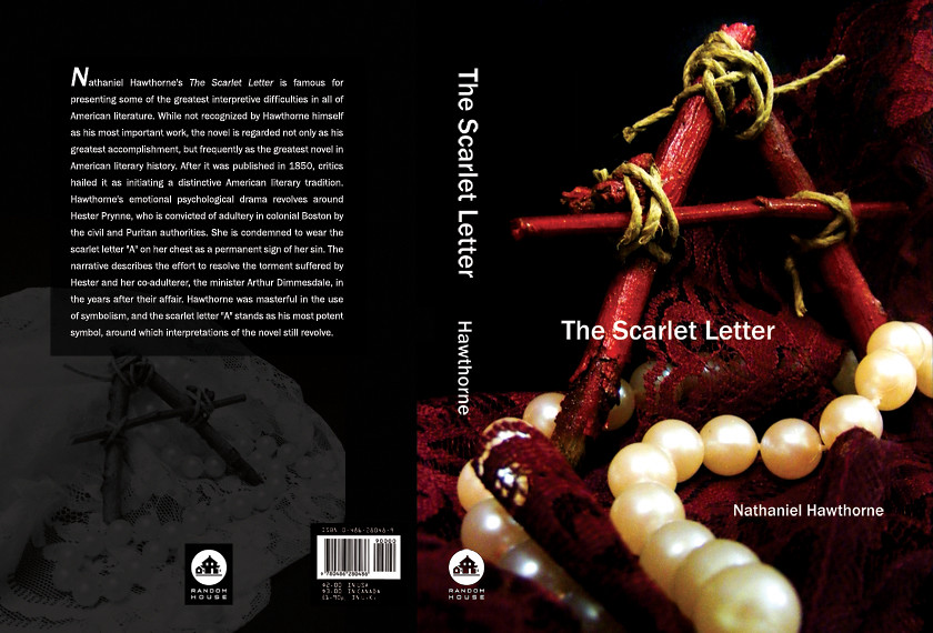
First up: my book cover redesign of The Scarlet Letter. This is my favorite piece of those that I submitted. Before the review, I re-worked the back cover, which originally only had a border of lace along the left-hand side. I thought it was too "blah" and needed something much more interesting, so I opted to take out the lace and use an alternate photo I had taken during the cover shoot and screen it in the background behind the text.
I'm pretty happy with my decision. :)

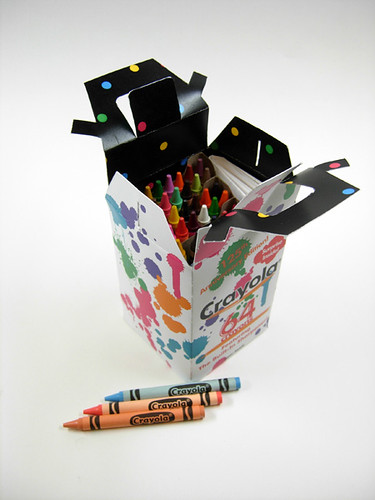
Next is my packaging project. I re-packaged a 64-count box of Crayola crayons for their "125th anniversary edition" with a special fold-out coloring poster inside. I worked the hardest on "engineering" the package itself & ultimately I think the handle could have been made stronger, which was my biggest challenge.


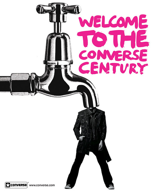
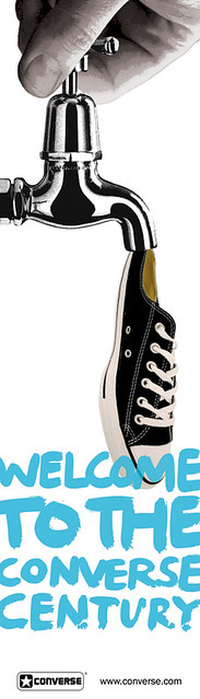
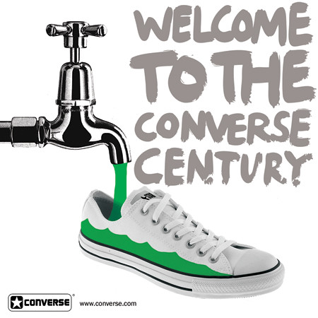
Up next is my Converse collage-ad campaign. We used found images from magazines and the internet to create 3 cohesive magazine ads. I used a mostly black-and-white scheme with a single splash of color in each. I also carried across the faucet image (scanned in from a magazine) and utilized it in different ways. I wanted to give it a surreal/absurd aesthetic, as Converse always seemed to have an "alternative" vibe.


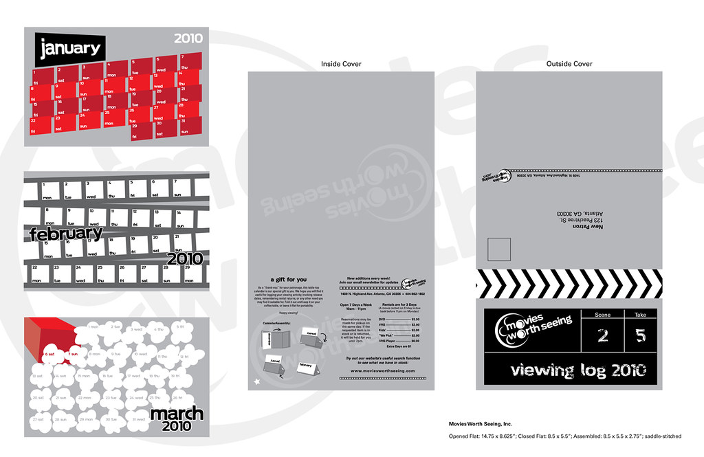
Next is my stationery suite for Movies Worth Seeing. It went through many transformations before becoming the final product, but I am satisfied with the outcome.

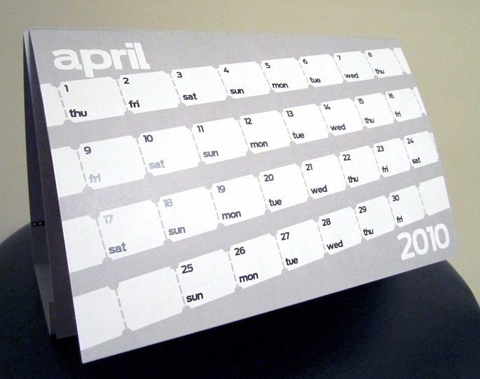
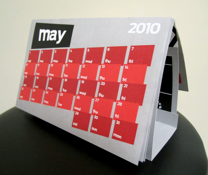
Lastly is my direct mailer from the same re-branding project as above. This was by far my favorite piece from the branding project, and it definitely took the most time.


First up: my book cover redesign of The Scarlet Letter. This is my favorite piece of those that I submitted. Before the review, I re-worked the back cover, which originally only had a border of lace along the left-hand side. I thought it was too "blah" and needed something much more interesting, so I opted to take out the lace and use an alternate photo I had taken during the cover shoot and screen it in the background behind the text.
I'm pretty happy with my decision. :)
Next is my packaging project. I re-packaged a 64-count box of Crayola crayons for their "125th anniversary edition" with a special fold-out coloring poster inside. I worked the hardest on "engineering" the package itself & ultimately I think the handle could have been made stronger, which was my biggest challenge.

Up next is my Converse collage-ad campaign. We used found images from magazines and the internet to create 3 cohesive magazine ads. I used a mostly black-and-white scheme with a single splash of color in each. I also carried across the faucet image (scanned in from a magazine) and utilized it in different ways. I wanted to give it a surreal/absurd aesthetic, as Converse always seemed to have an "alternative" vibe.
Next is my stationery suite for Movies Worth Seeing. It went through many transformations before becoming the final product, but I am satisfied with the outcome.

Lastly is my direct mailer from the same re-branding project as above. This was by far my favorite piece from the branding project, and it definitely took the most time.
Aug 26, 2010
Time Line Project
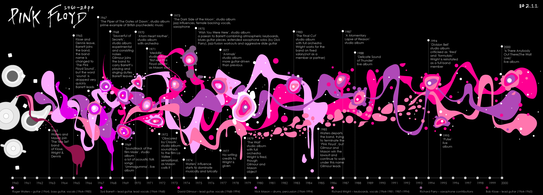
One of our first projects in advanced typography is to create a timeline of our lives and how we got to where we are today. I'm still brainstorming, but I found these images interesting:


Aug 22, 2010
Aug 16, 2010
Feeling Good
A friend posted this on good ol' Facebook and I wanted to share since I love this song and I'm pretty sure I'll be doing something like it soon.
Nina Simone - Feeling Good
Nina Simone - Feeling Good
May 4, 2010
Portfolio Review
Just dropped off my portfolio a while ago. Good luck to everyone! See ya on the other side. :)
Subscribe to:
Posts (Atom)