"Eat Well" Magazine Redesign
Innovative combination of photography and graphic elements to update the "Eating Well" Magazine brand to one targeted towards a more diverse audience.
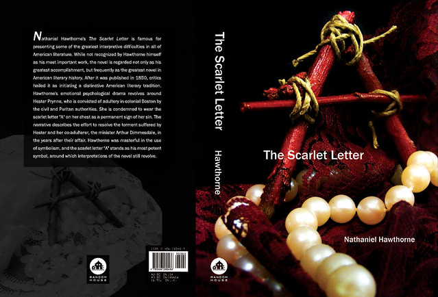
Scarlet Letter Book Cover
Effective use of dramatic photography and simple typography to convey the juxtaposition of elements within the story itself.
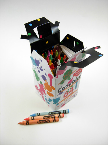
Crayola Packaging Redesign
Updating the Crayola box with a fresh & colorful look to further the youthful, fun and creative branding Crayola promotes.

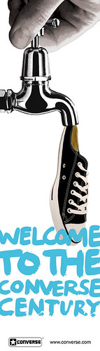
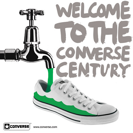
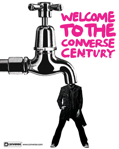
Converse Shoes Ads
Uses creative concepts to bring together found elements (from print & online) while maintaining the "alternative" brand aesthetic.
Kinetic Typography
Successful use of After Effects to create an engaging, dynamic type-oriented motion piece following a skit from the TV show Scrubs.
The green converse shoe is my fave! I love your stuff!
ReplyDelete