I like this cover of Radiohead's In Rainbows for the bold colors and large headlining type.

When Muse's (<3) Black Holes and Revelations came out I was overjoyed. The album artwork itself leaves some to be desired, but the subsequent artwork that was released for the various singles is exquisite!
Original Album:

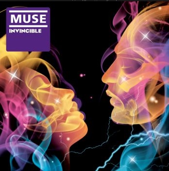
Later artwork:

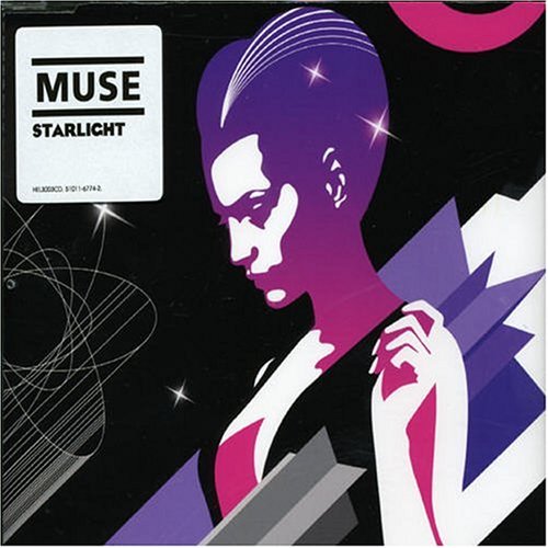
I was so in love with the above portrait of the band that I bought the poster, frame and all. It's absolutely lovely. :)


Beastie Boys' To the Five Boroughs has a cool package in that the digi pack folds out to reveal a super long, double-sided drawing of the East and West sides of NYC (one on either side) with the lyrics from the songs running throughout. Click the album cover below for more info:


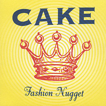
Cake's album art has a very strong, distinct look to it. The band name is bold at the top with a vintage-looking illustration below.


Beck's The Information had a very clever twist to its package. The cover looks very simplistic with "Beck" on the front and a light blue-on-white grid paper look for the background. When you open the package though, behind the seemingly plain insert is a fold-out sheet of stickers you can use to decorate the insert yourself! I used a few on sketchbooks and such, but sadly never actually used them on the CD insert. I should get a jump on that!
Click for more info:

No comments:
Post a Comment